Conversion & Web Redesign
UX Research • UX/UI Design • Web Design • Brand Evolution
Full funnel UX audit and redesign of Pavilion’s homepage, chapter pages, and membership pages to reverse declining conversion
*Designed and built while employed at Pavilion
About Pavilion
Pavilion is a closed membership community for go-to-market (GTM) leaders. They bring together over 8,000 members internationally, and offer education, mentorship opportunities, and exclusive experiences to professionals at varying levels.
8,000k+
members across 50 chapters
17k+
annual enrollees in educational courses
25
full-time employees (as of June 2026)

Overview
Despite steady overall site traffic, conversion into Pavilion’s application funnel was softening across the board. Visitors reaching the application and completing the first step, were both trending down. I ran a full UX audit across Pavilion’s core conversion flows to find out why, then used the findings to guide a brand evolution, homepage relaunch and a full rebuild of the chapter and membership pages.
Main Problems
Navigation relied on inconsistent, often internal only terminology, including mixed use of "Tier 1 Chapter" and "Programs" versus "Courses" versus "Schools."
CTA language shifted across the site between "Join," "Apply," and "Enroll," adding friction at the moment of conversion.
Content was written for a generic visitor instead of Pavilion's five distinct member personas.
Trust signals like testimonials and instructor bios were almost entirely missing.
Chapter pages were static, with no events, RSVP options, or visible chapter lead contact info.
Membership tier language didn't map clearly to a visitor's role, and the join page lacked social proof.
Project Wins
Chapter page conversion increased from 22% to 28%.
First tier (Executive) membership page conversion increased from 11% to 22%.
Built and maintained the weekly analytics reporting used to track funnel health and applicant quality on an ongoing basis.
Responsibilities and Scope
This project was completed as a sole designer embedded on a small marketing team, with review from marketing leadership. I led the UX audit end to end, translated the findings into a brand evolution, homepage relaunch, and rebuilt the chapter and membership pages with reusable custom HubSpot modules.
I operated as a design team-of-one and served as a UX researcher, designer, and front end developer on this project.
Research and Analysis
Getting Started
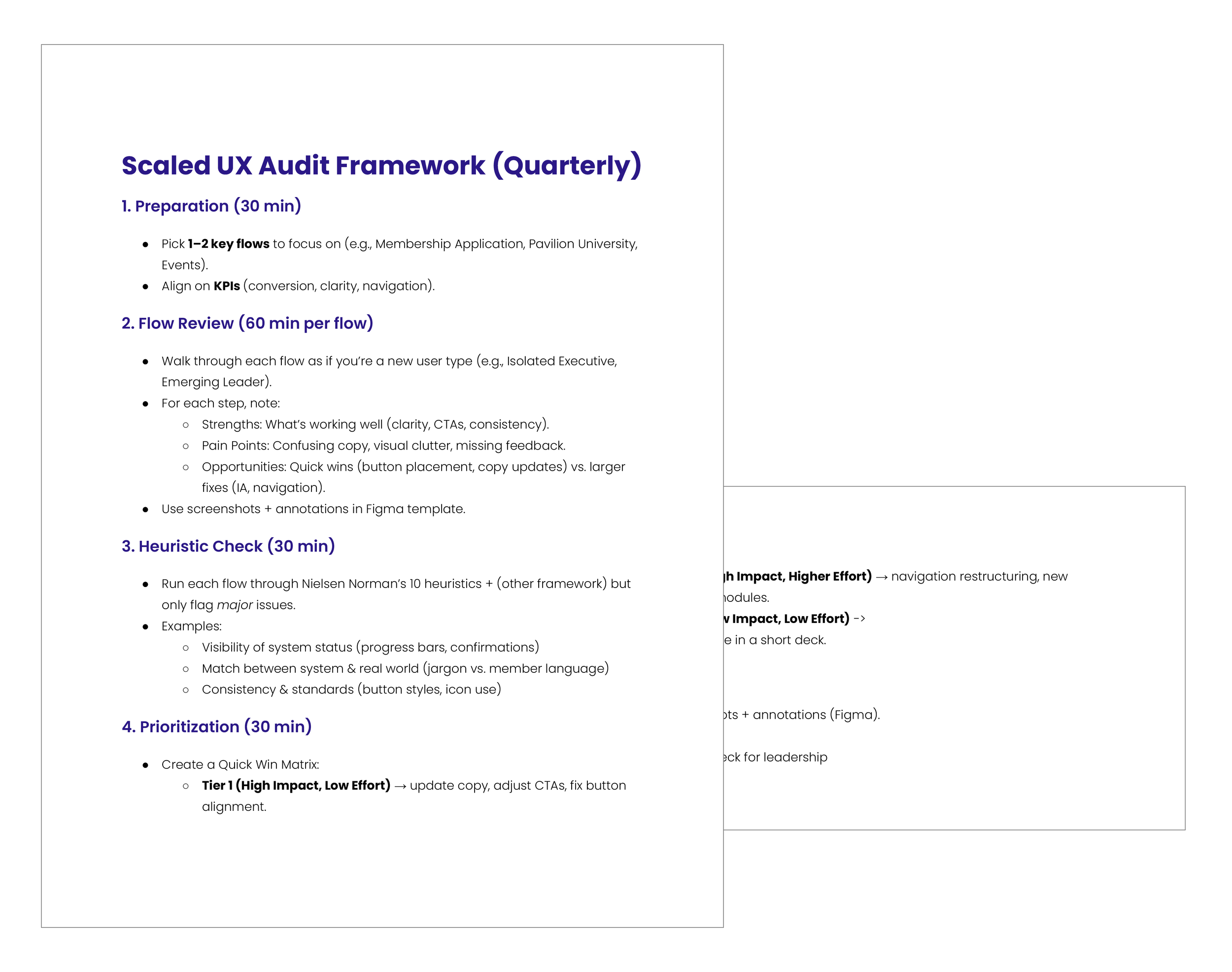
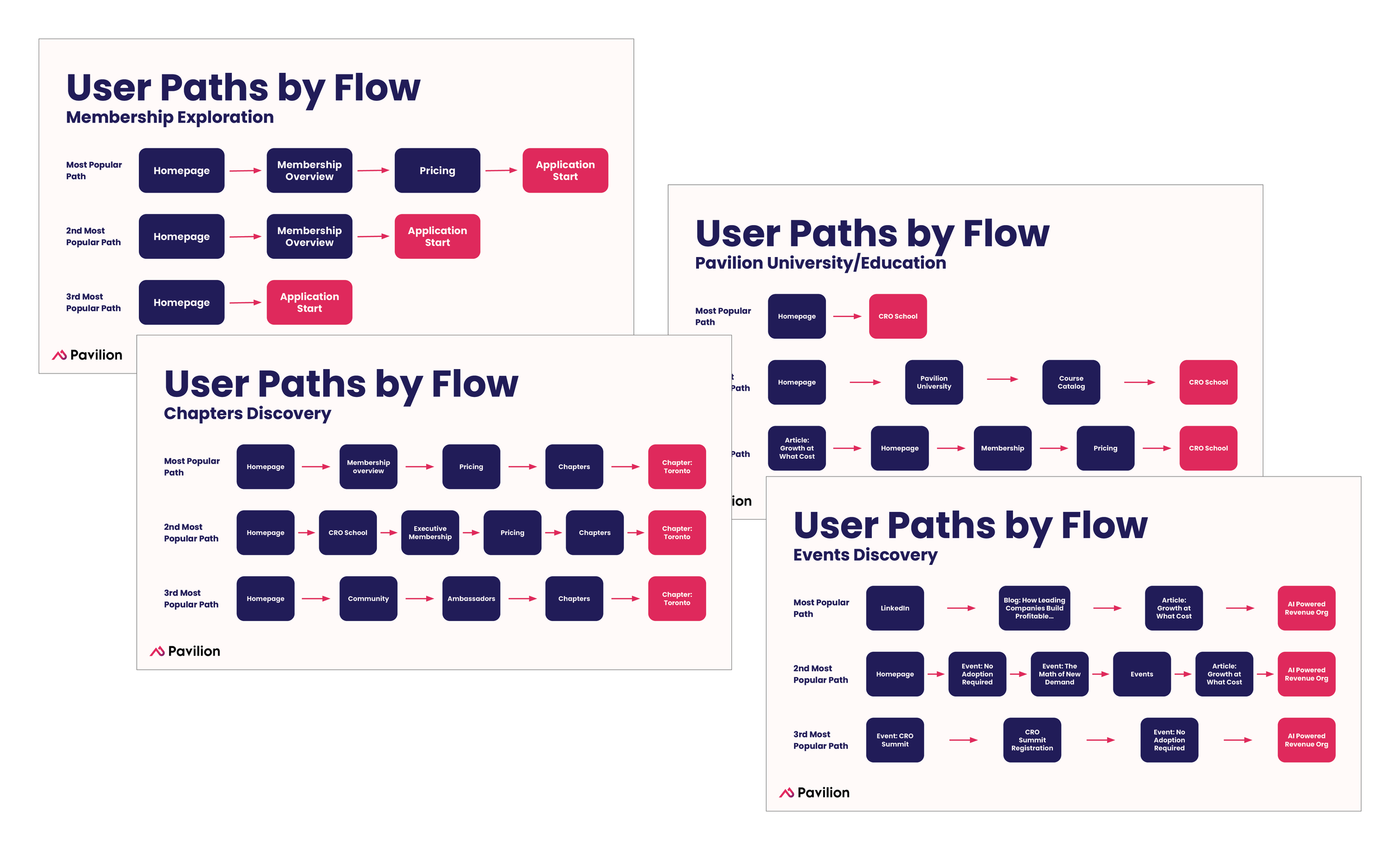
I mapped Pavilion’s four core user flows, membership exploration, chapters discovery, Pavilion University, and events discovery, and evaluated each against five member personas. I ran a full heuristic evaluation and layered in a WCAG-based accessibility review to surface friction across navigation, content clarity, and conversion.
The main focus areas included navigation, content clarity, accessibility, and conversion friction. Rather than treat the audit as a one-time deliverable, I built the findings into a repeatable framework the team could re-run each quarter for consistent improvements.
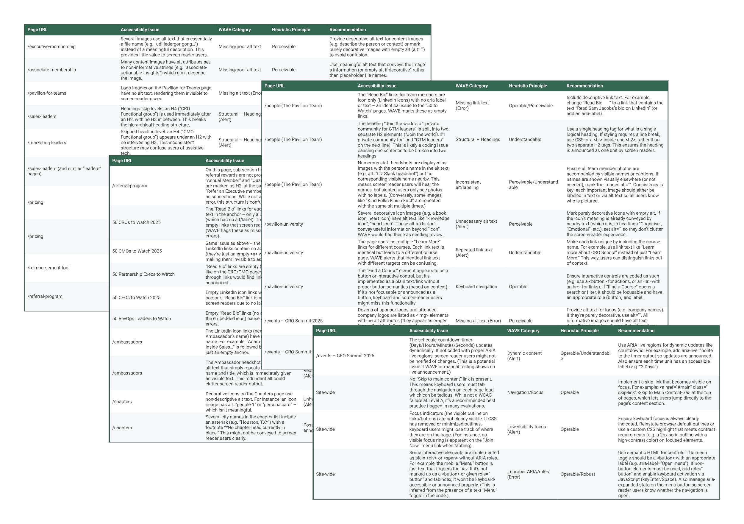
Accessibility Audit for all high traffic pages
A heuristic evaluation was performed across all main navigation pages
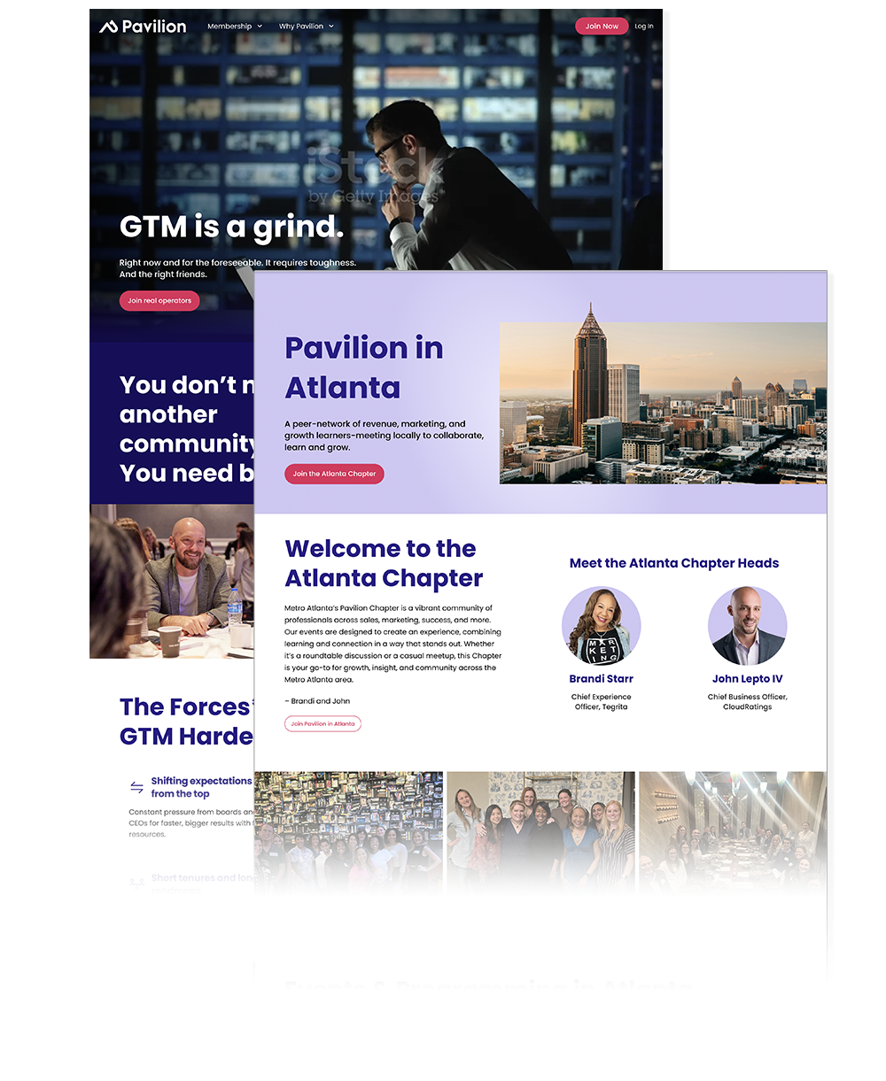
Homepage Redesign
The audit’s sitewide findings, including clearer CTA language, tighter navigation, and stronger trust signals, informed a homepage relaunch as part of the same initiative.
The updated version of the homepage can be viewed at joinpavilion.com.
Previous homepage
Updated homepage design
Chapter & Membership Redesign
I rebuilt the chapter and membership pages in HubSpot CMS with two goals in mind: flexibility for future updates, and enough rigidity to keep everything aligned to current brand standards.
Non-technical teammates can now update content and imagery without needing design or development support, while the underlying structure keeps every page visually consistent.
This work also carried the visual brand evolution across the board, bringing chapter and membership pages in line with the updated look and feel introduced elsewhere on the site.
Previous Chapter page
Updated local Chapter page design
Brand Evolution
All tier one navigation pages were redesigned to reflect this same brand evolution. The palette shifted toward a darker blue to signal trust and stability, and imagery moved away from duotone treatments in favor of real photos of community members, moving the visual identity toward one that better reflects the sense of community Pavilion is built on.

Next Steps
Future State
The audit framework was built to be re-run quarterly, so future rounds can keep surfacing new opportunities as Pavilion’s membership base grows or team resources fluctuate.
Additional Work
Alongside this project, I also led:
A 90 day onboarding tracking initiative and cohort based onboarding experiments to improve member retention
A/B tests for the application and pricing pages, and coordination of a beta tester group
Brand strategy across Pavilion's event portfolio, including early design research for a sponsor portal
The analytics infrastructure and department project management system that keep the marketing team running day to day